
ROLE Product Strategy · Research · Ideation · UX · UI
TEAM 3 Engineers · 2 Designers · 1 Content creator · Founder · CEO
METHODOLOGY Hybrid, Scrum+Kanban (full-time remote team)
TOOLS Figma · Hotjar · Optimal Workshop · Stark · Funkify
TIMELINE Q1 · Q2 2021
BACKGROUND
Small and mid-sized enterprises are an important factor in the global economy. Digital transformation is vital, and the pandemic has made it more urgent. Since 2018, Turingo has been helping entrepreneurs to start their digital transformation through online courses. I was part of an ambitious project to redesign the existing platform with a new architecture to allow community integration, giving entrepreneurs a chance to network, learn, and grow.
Small and mid-sized enterprises are an important factor in the global economy. Digital transformation is vital, and the pandemic has made it more urgent. Since 2018, Turingo has been helping entrepreneurs to start their digital transformation through online courses. I was part of an ambitious project to redesign the existing platform with a new architecture to allow community integration, giving entrepreneurs a chance to network, learn, and grow.

THE CHALLENGE
MISSING THE COMMUNITY ON OUR WEBSITE
MISSING THE COMMUNITY ON OUR WEBSITE
Turingo began as an online learning platform, but users' demand for collaboration led to the creation of an external organic community, impacting site engagement and retention, with only a small portion participating, leaving 90% of registered users without the chance to build connections and the company missing out on new business opportunities.
GOAL
TIME TO PIVOT & REDESIGN
The goal is to pivot the existing paradigm and business model, placing communities as the core, by redesigning the platform with a new architecture to build the foundations for incoming interaction and collaboration features. The objective is to continue providing tools and skills through online courses and offer a community for entrepreneurs to learn, share, grow, and succeed, all within a unified platform.
PROCESS
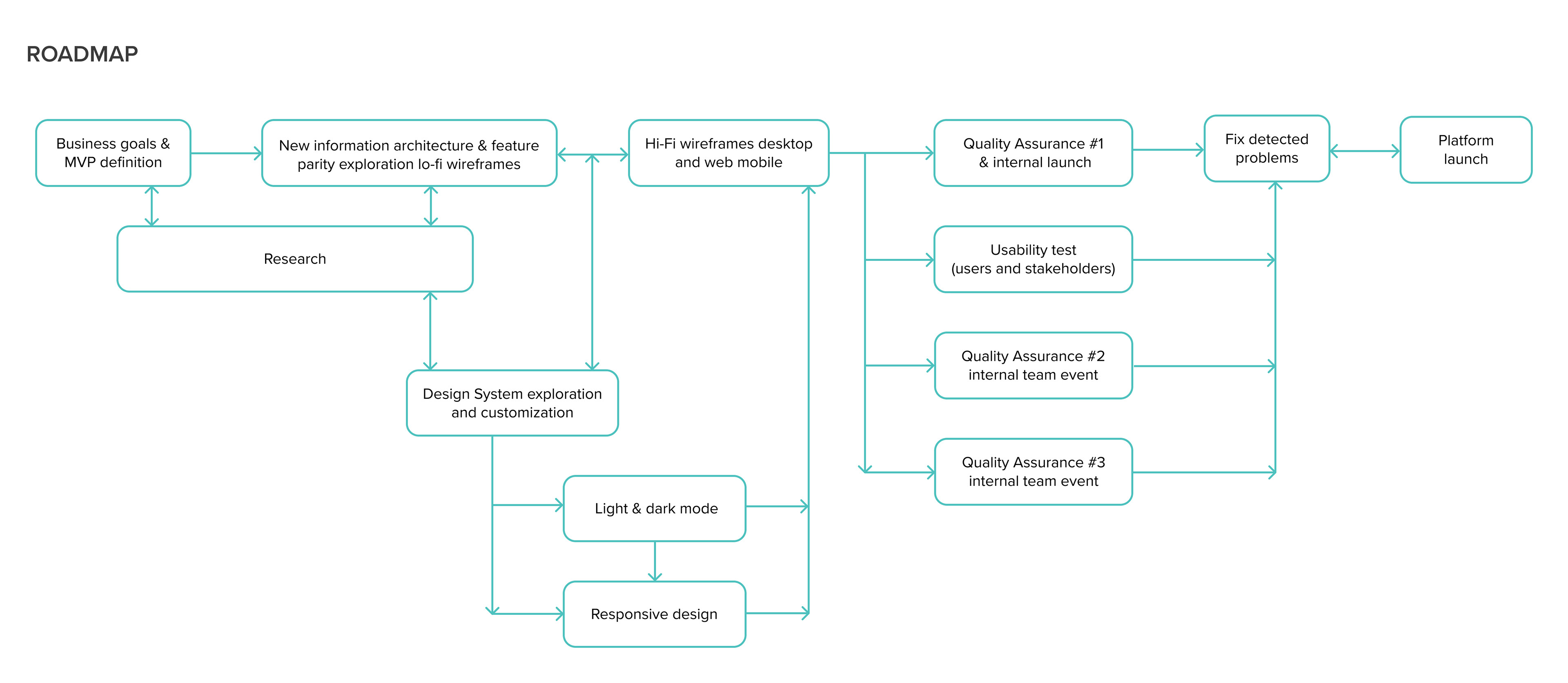
1 BIG GOAL, 3 PHASES
I led the entire design process along with another designer, collaborating with a cross-functional team. We discussed the legacy and new business goals and user needs and prioritized MVP definition, dividing this big project into 3 phases. Using user research and design thinking, I identified key pain points, driving a user-centered platform redesign with a new architecture.
DESIGN STRATEGY

USER RESEARCH
WHAT DO WE KNOW ABOUT OUR USERS?
I helped set up and led the research team in the company. I did 8 interview sessions and 2 surveys of 150 and 170 participants to know our users and their experiences with the platform and the community. Some of the key insights are:
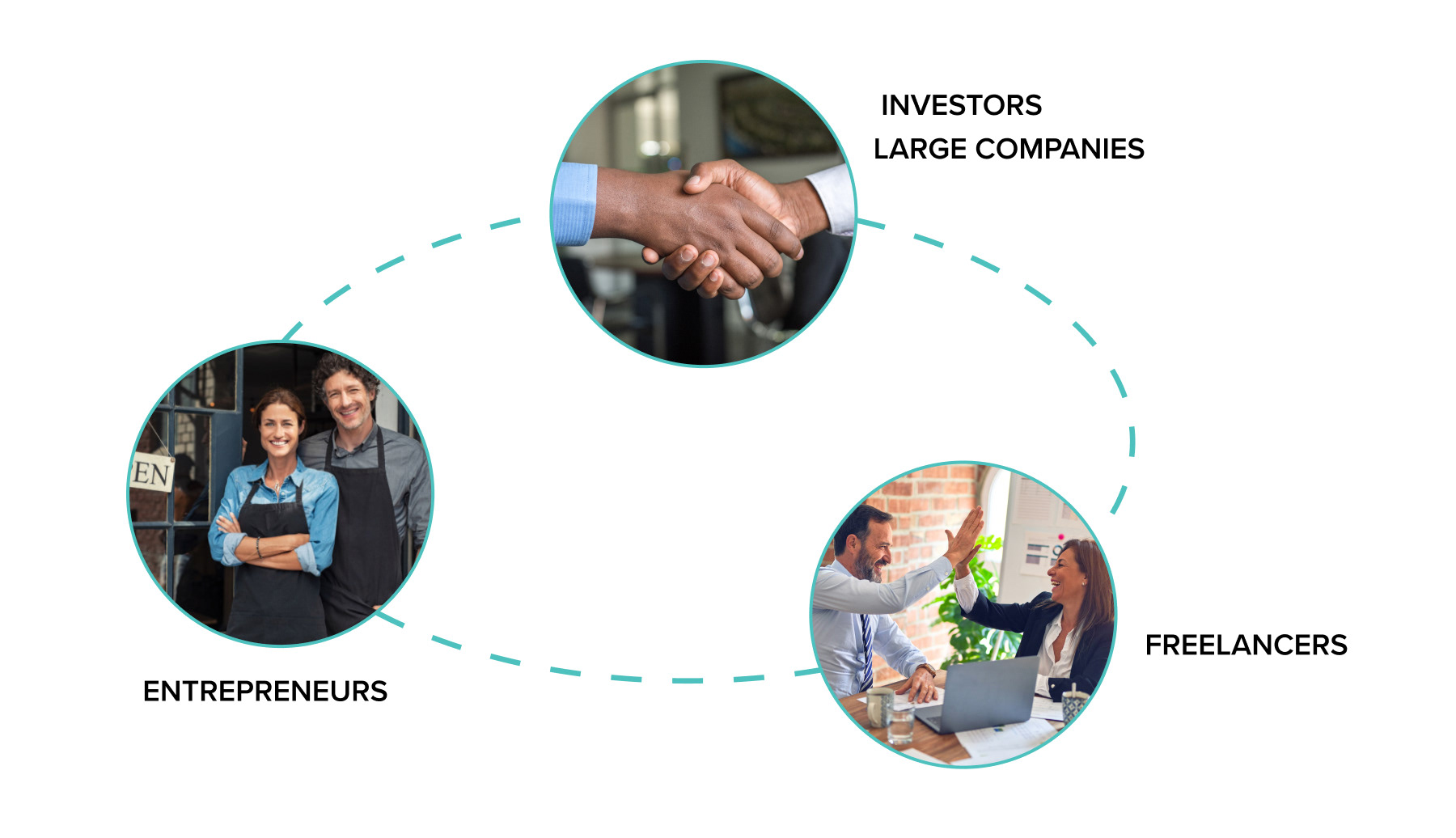
1 • Turingo has 3 primary user groups. Small business owners who want to start or grow their businesses. Freelancers who act as mentors/advisers/contractors, and Investors/large companies who look to sponsor and create content for their clients.
2 • The WhatsApp community organically started in 2019, reaching the top of users. After testing Discourse with poor engagement, the community migrated to Telegram, growing to +600 members and creating an ecosystem that solves their needs through collaboration.
3 • Users are willing to collaborate and have participated as speakers and mentors. They accept being part of a new platform, having everything in one place, and participating in an entrepreneurial network.
4 • Small business owners feel alone in the entrepreneur journey and would like to network with people to share experiences and knowledge.
WHAT DO WE KNOW ABOUT OUR USERS?
I helped set up and led the research team in the company. I did 8 interview sessions and 2 surveys of 150 and 170 participants to know our users and their experiences with the platform and the community. Some of the key insights are:
1 • Turingo has 3 primary user groups. Small business owners who want to start or grow their businesses. Freelancers who act as mentors/advisers/contractors, and Investors/large companies who look to sponsor and create content for their clients.
2 • The WhatsApp community organically started in 2019, reaching the top of users. After testing Discourse with poor engagement, the community migrated to Telegram, growing to +600 members and creating an ecosystem that solves their needs through collaboration.
3 • Users are willing to collaborate and have participated as speakers and mentors. They accept being part of a new platform, having everything in one place, and participating in an entrepreneurial network.
4 • Small business owners feel alone in the entrepreneur journey and would like to network with people to share experiences and knowledge.
WHERE TO START?
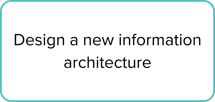
A NEW ARCHITECTURAL INFORMATION
A NEW ARCHITECTURAL INFORMATION
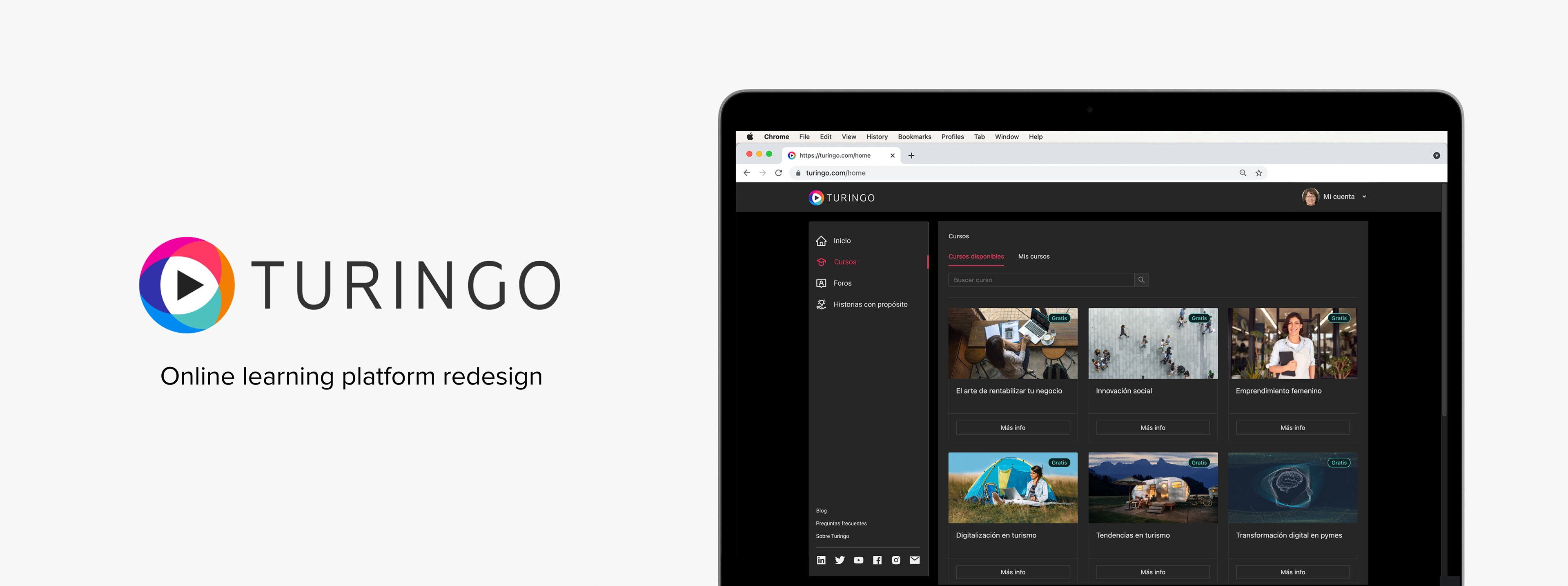
Collaborated across engineering and design to update the platform's structure, shifting from video streaming to a post-based system, enabling users to create content in the future. The platform was crafted in light and dark modes for user preferences, ensuring responsiveness for optimal performance and satisfaction.
I conducted secondary research, drawing inspiration for the new architecture design from educational websites displaying online course information and community platforms, considering interactions for future integrations.
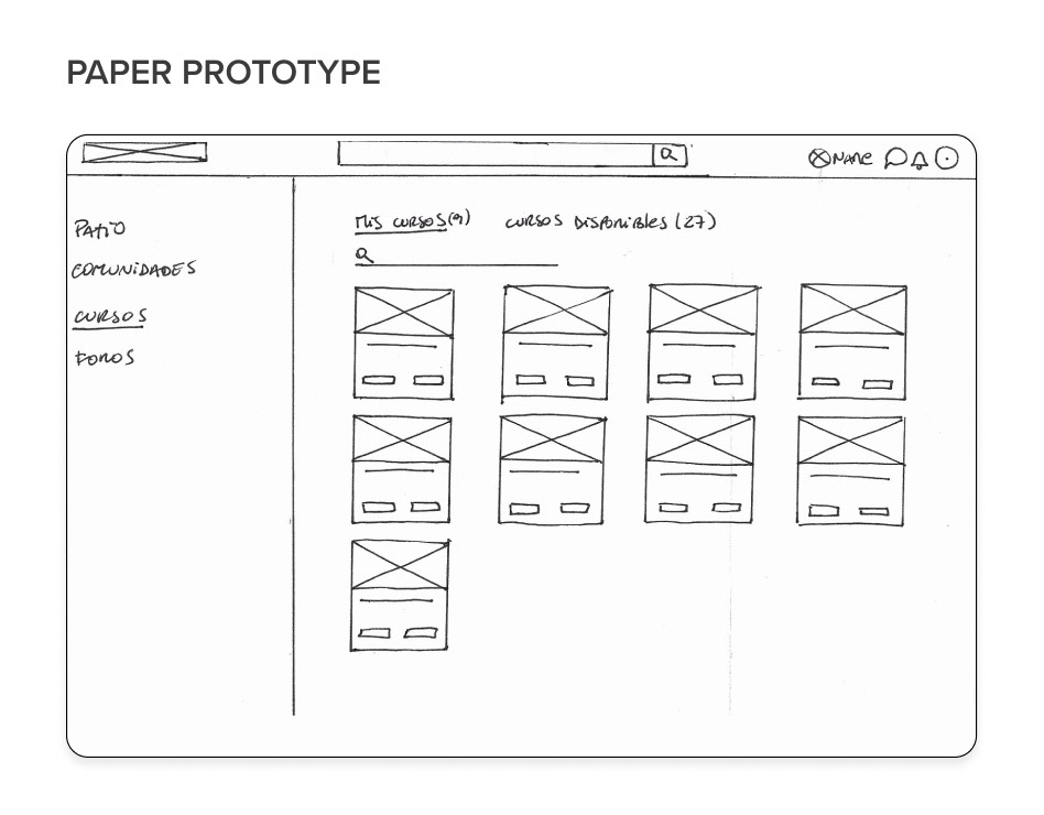
I conducted card sorting sessions to categorize website content, designing a sitemap and user flows for each section with iterative improvements. Implemented a left-right layout with a fixed left navigation and dynamic right work area for optimal information display based on page and screen size.

DOCUMENTATION FOR EVERYONE
BUILDING A DESIGN SYSTEM
As the company grew, the need for a design system became crucial for a common language and optimized communication among designers and multidisciplinary teams. We didn't have any consistent design documentation on the previous platform.
BUILDING A DESIGN SYSTEM
As the company grew, the need for a design system became crucial for a common language and optimized communication among designers and multidisciplinary teams. We didn't have any consistent design documentation on the previous platform.
The decision to adopt Ant Design, an open-source system with resources for designers and developers, was made to optimize both short-term and long-term efficiency, enabling faster and more efficient creation of human-centered designs with a robust and customized UI system and code-based component library.
FEATURE PARITY
ORGANIZING OUR EXISTING CONTENT
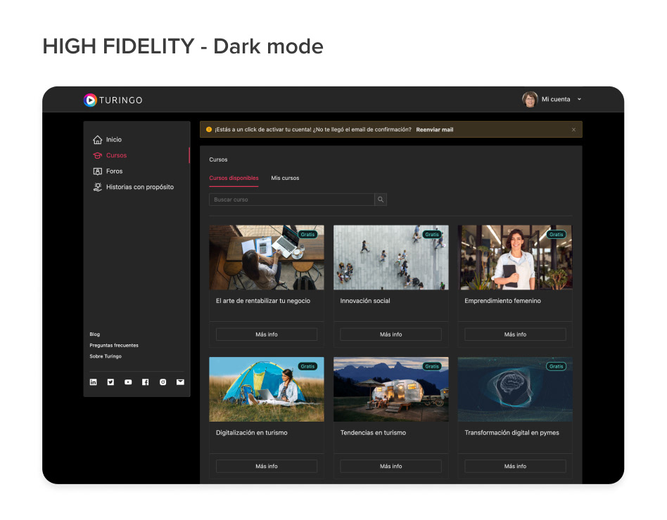
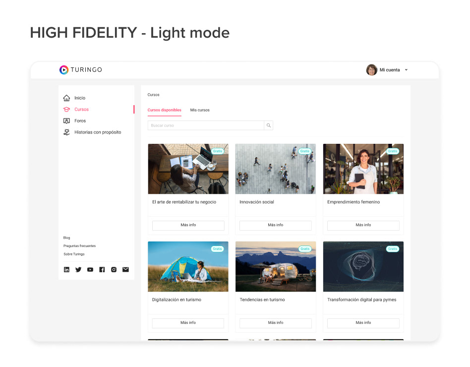
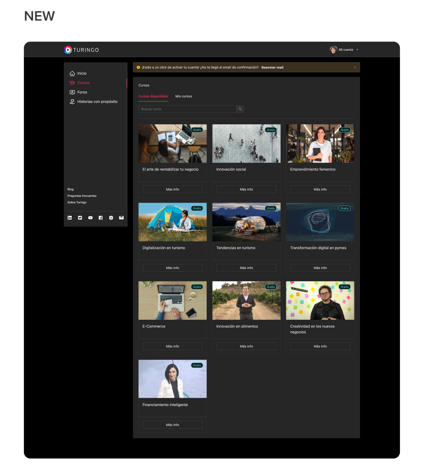
The platform design was revamped for three main sections: video catalog, course landing page, and video player section, designed in light and dark modes across seven screen sizes, catering to diverse user preferences.
ORGANIZING OUR EXISTING CONTENT
The platform design was revamped for three main sections: video catalog, course landing page, and video player section, designed in light and dark modes across seven screen sizes, catering to diverse user preferences.
We defined design alignments for the project, and we came up with 4 principles:
1 • Simple visual language to not overwhelm the users
2 • Structured for a consistent layout
3 • Organized to make the content easier to find
4 • Understandable to follow the user's mental models
1 • Simple visual language to not overwhelm the users
2 • Structured for a consistent layout
3 • Organized to make the content easier to find
4 • Understandable to follow the user's mental models
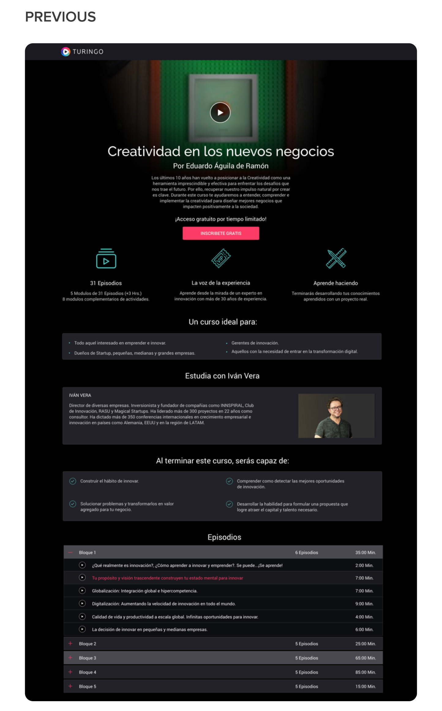
CATALOG
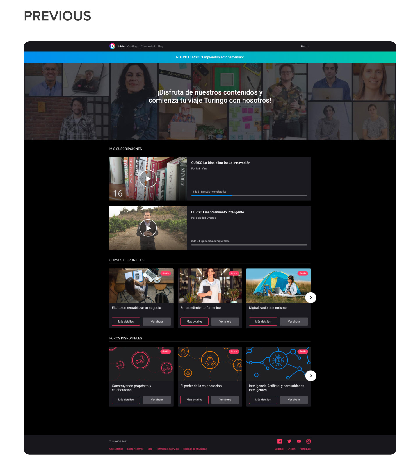
The old design was incompatible with the idea of having unlimited videos. Users had all the catalogs on different carrousels on the same screen, including their progress, confusing and exhausting their user's experience. The new design features a side navigation, where each category has its own section, allowing unlimited videos in the central column. It also includes a search bar that optimizes users' time by displaying results as the user types and tabs to separate the content available from subscribed videos, keeping track of their progress.
The old design was incompatible with the idea of having unlimited videos. Users had all the catalogs on different carrousels on the same screen, including their progress, confusing and exhausting their user's experience. The new design features a side navigation, where each category has its own section, allowing unlimited videos in the central column. It also includes a search bar that optimizes users' time by displaying results as the user types and tabs to separate the content available from subscribed videos, keeping track of their progress.
COURSE LANDING PAGE
When users visit a specific course, they can access essential information about it. Still, every time we needed to add extra detail, the page length increased, affecting mobile users and increasing the risk of product abandonment due to the site's layout. To help them scan and make faster decisions, I organized this page by clustering the related info, reducing the screen length, and bringing the relevant information to the top. Also, I considered room for future implementations, like reviews or comments.
When users visit a specific course, they can access essential information about it. Still, every time we needed to add extra detail, the page length increased, affecting mobile users and increasing the risk of product abandonment due to the site's layout. To help them scan and make faster decisions, I organized this page by clustering the related info, reducing the screen length, and bringing the relevant information to the top. Also, I considered room for future implementations, like reviews or comments.

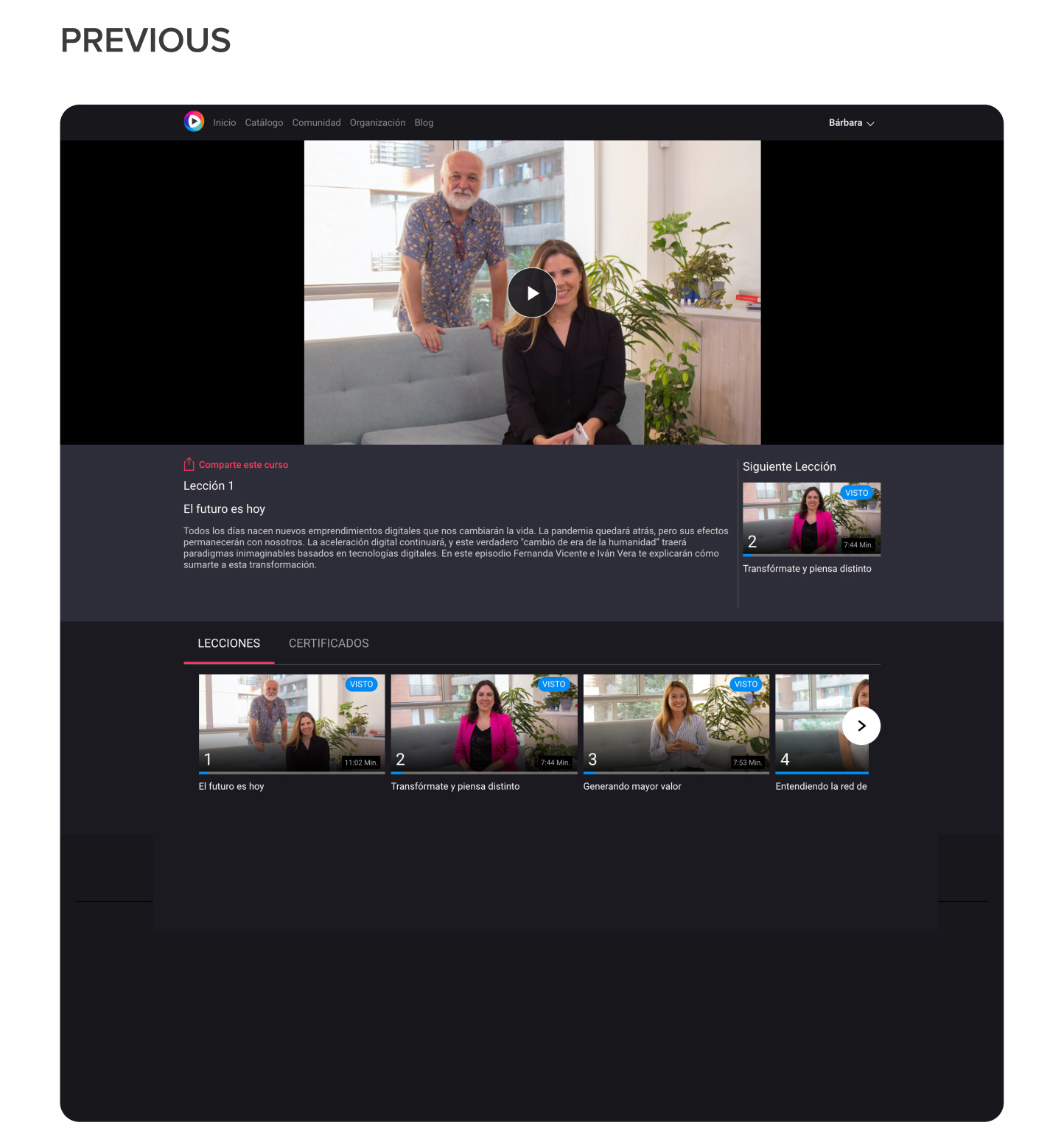
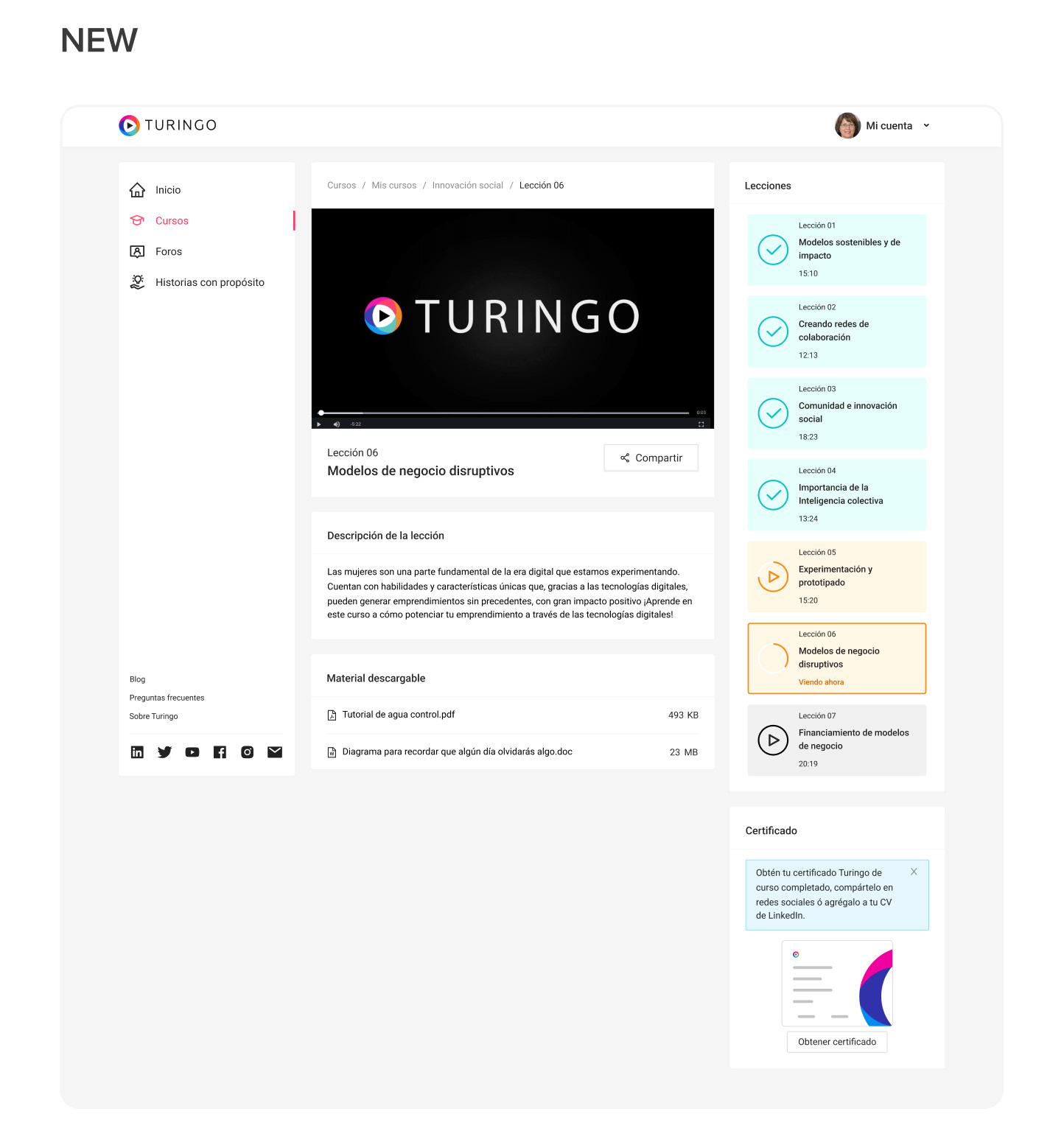
VIDEO PLAYER
It had the essential info, but because extra detail was added without structure, and as users noted, “the page started to look a little disorganized, and repeated information in different places became confusing.” With the new design, I positioned the player and playlist first, helping users find the primary information quickly, and leaving structured space for future implementations, maintaining the course landing page structure with 2 columns.
It had the essential info, but because extra detail was added without structure, and as users noted, “the page started to look a little disorganized, and repeated information in different places became confusing.” With the new design, I positioned the player and playlist first, helping users find the primary information quickly, and leaving structured space for future implementations, maintaining the course landing page structure with 2 columns.
RESULTS
• 50% increase in certificate completion
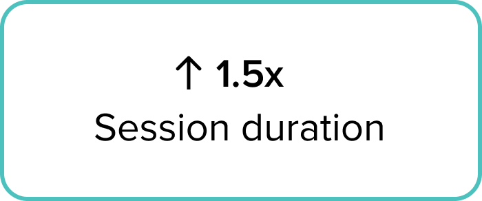
• 1.5 increase in session duration
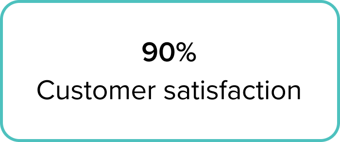
• 90% Customer Satisfaction Score (CSAT)
• 50% increase in certificate completion
• 1.5 increase in session duration
• 90% Customer Satisfaction Score (CSAT)
USER INFORMATION
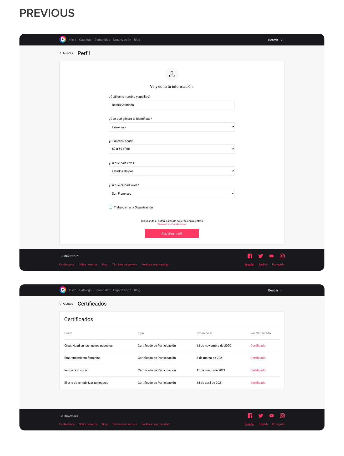
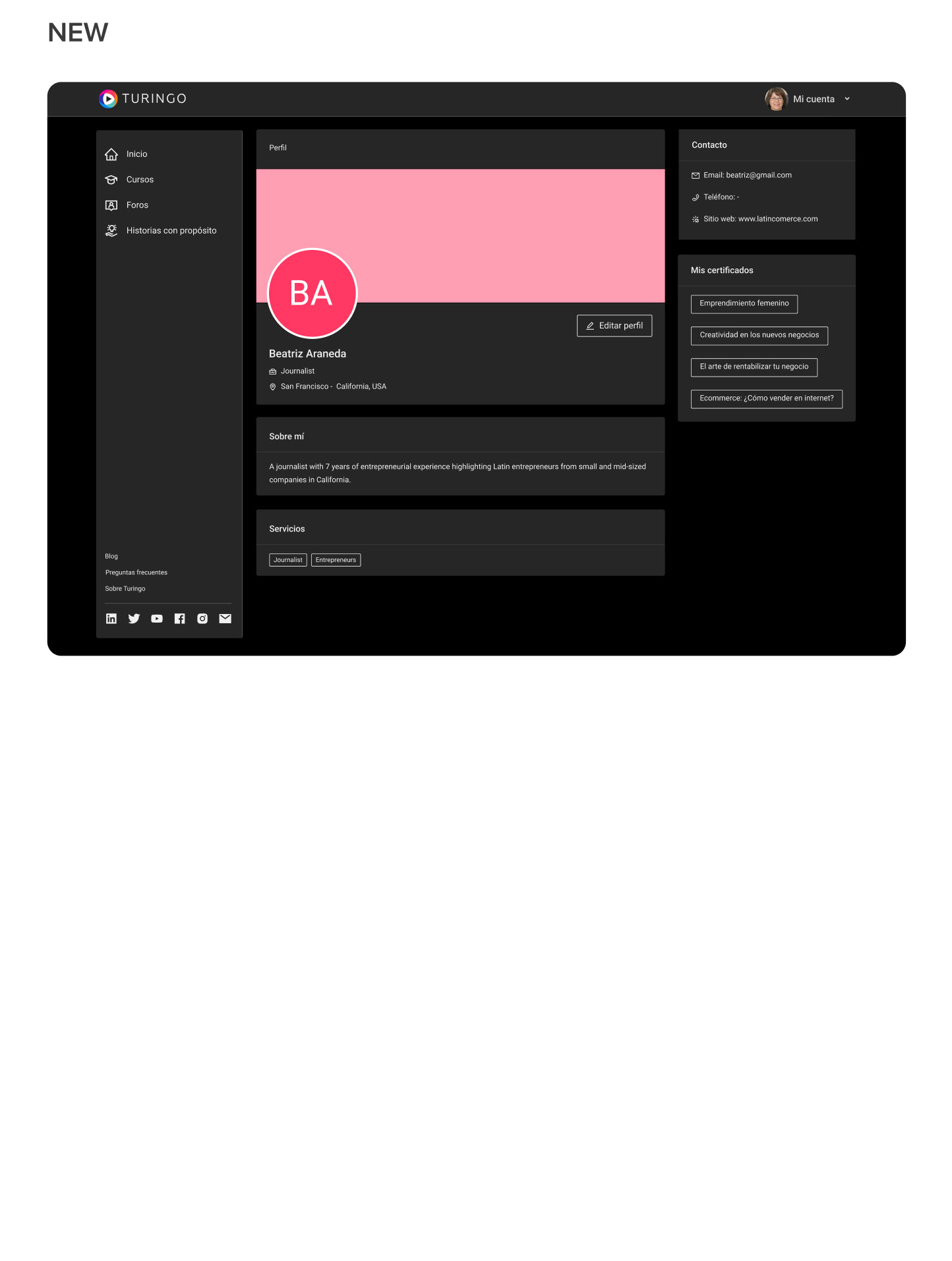
PROFILE & CERTIFICATES
Both sections were previously located in different places, causing challenges for users to find them easily, resulting in low task accomplishment and poor engagement. With the new design, users can conveniently complete their profiles and view certificates in one unified location, focused on gathering less personal information and more business related details.
RESULTS
• 20% more access to certificates and profile sections
• Contact email, phone, job position, and profile picture were the most edited options.
• 20% more access to certificates and profile sections
• Contact email, phone, job position, and profile picture were the most edited options.
HOW TO COMMUNICATE
FREQUENTLY ASKED QUESTIONS
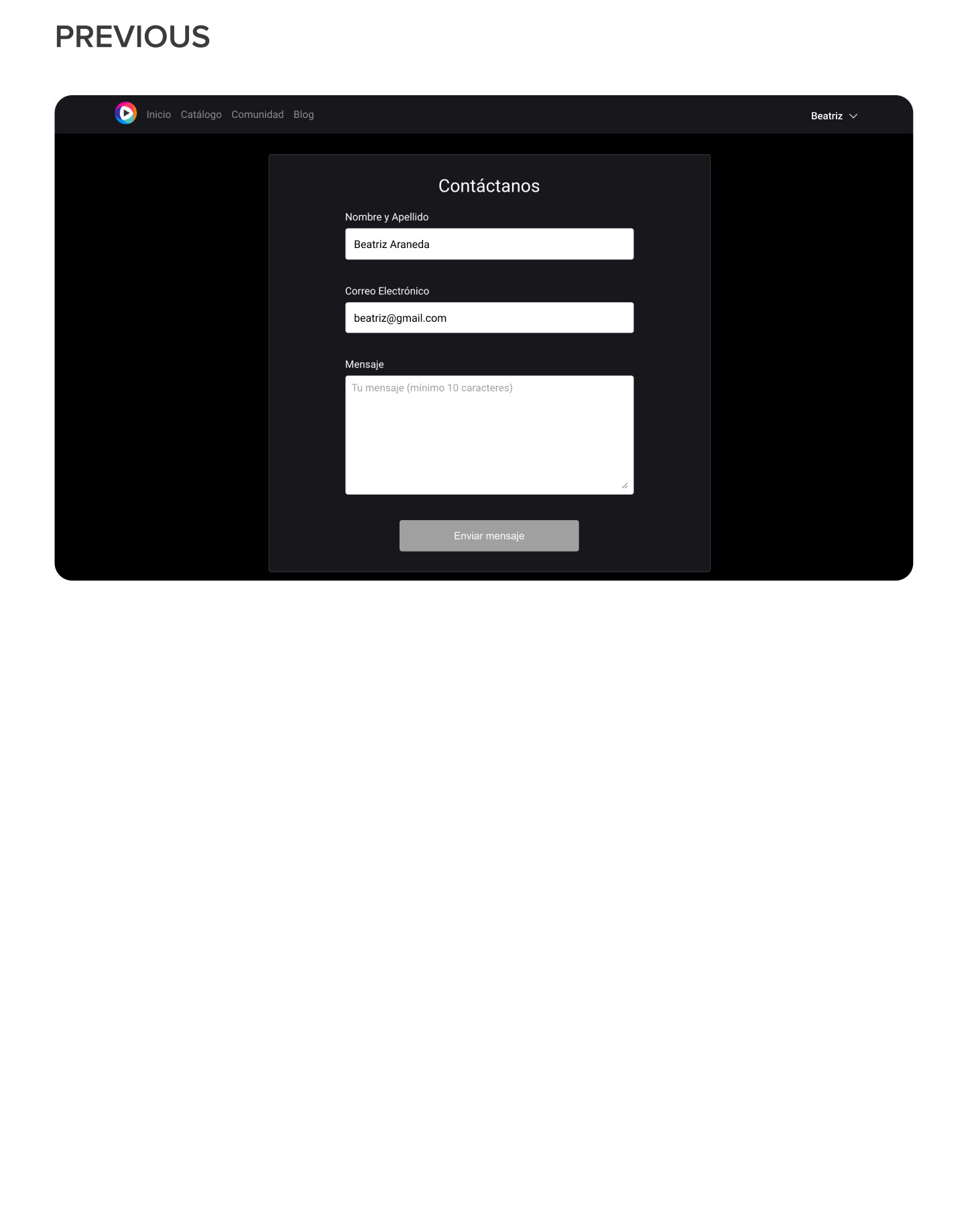
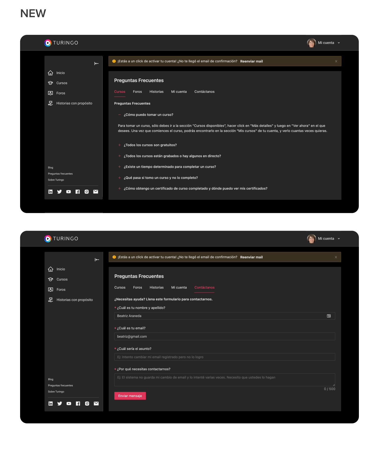
We had a basic contact form in the previous design without extra information. Although the design interface was poor, it worked. We received numerous emails from users asking about the platform. To make information accessible and friction-free for users, I created a Frequently Asked Questions (FAQ) section with a list of commonly asked questions. If they still can't find the info, they can send an email through an improved contact form, all on the same page.
RESULTS
• 50% reduction of emails received, decreasing our team time answering emails.
FREQUENTLY ASKED QUESTIONS
We had a basic contact form in the previous design without extra information. Although the design interface was poor, it worked. We received numerous emails from users asking about the platform. To make information accessible and friction-free for users, I created a Frequently Asked Questions (FAQ) section with a list of commonly asked questions. If they still can't find the info, they can send an email through an improved contact form, all on the same page.
RESULTS
• 50% reduction of emails received, decreasing our team time answering emails.
VALIDATION
QA & USABILITY TESTING
QA & USABILITY TESTING
Performed 6 usability tests involving both registered users and team members. Participants encountered difficulties in 3 out of the 15 tasks, prompting iterative improvements to resolve the identified problems.
Conducted 4 internal quality assurance (QA) events as a team to identify and address issues before the release.
LAST THOUGHTS
CONCLUSION
As a product designer, my role in this small cross-functional team went beyond addressing challenges; it involved crafting solutions that significantly enhanced user experience and engagement. Navigating through ambiguity and tight timelines, collaboration, and constant communication were key to success.


